Beautiful design blends with nature.
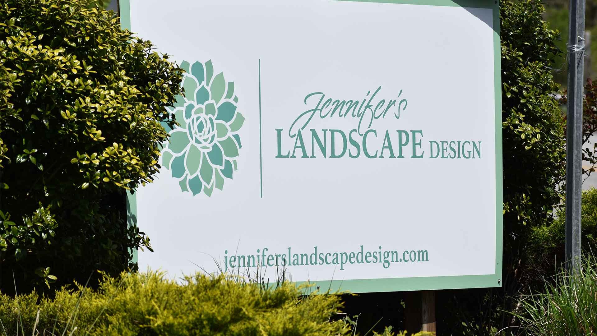
In its highest form, landscape design is about blending plants and structures with natural features to create seamless beauty. Jennifer's Landscape Design in Ellijay, Georgia embraces this ideal. They needed marketing and brand communications that express their approach to customers. Tonality created a logo, website, brochures, business cards, and signs that reflect the subtle intersection of thoughtful design and natural beauty.
Branding
- Strategy
- Logo Design
- Content Writing
Print Design
- Signs
- Brochures
- Business Cards
Web Design
- Site Planning
- Page Design
- Ongoing Support
Jenniferslandscapedesign.com is designed to engage visitors with striking images and illustrations. By emphasizing portfolio photographs in a simplistic setting, it directly communicates the design approach of Jennifer’s Landscape Design.
To introduce the new brand and foster name recognition, a permanent metal sign was designed for use on a major highway. This minimal design draws attention to the brand logo and web address.
The word mark logo reinforces the personal aspect of Jennifer’s Landscape Design through a script paired with a capitalized serif typeface. The two typefaces intertwine to blend them into one form.
The logo symbol is meant to visually represent the elegant design style of Jennifer’s Landscape Design. It is based on the “Hen & Chicks” succulent that is frequently used in rock gardens.
As an alternative to the vertical color format, the logo signature for Jennifer’s Landscape Design can also be used in a horizontal layout with the option of monochrome printing.
This trifold brochure (7” x 14”) introduces Jennifer’s Landscape Design by describing their design philosophy, experience, and services. Portfolio photographs are emphasized in a similar way to the corresponding website.
This two-sided business card corresponds to the Jennifer’s Landscape Design brand with memorable graphics and simple design.
To visually separate Jennifer’s Landscape Design from others, a series of illustrations were created to blend landscape photographs with design sketches, showing the process and the results in one image.
This colorization of a landscape drawing was used to show the planning process that Jennifer’s Landscape Design provides, while blending with the design style of the website.